Why UI/UX Mistakes Are the Silent Reason Apps Fail
Imagine you have downloaded an app for something important, but the interface is boring, confusing, or has glitches. That definitely feels frustrating, leaving you with no choice but to leave the app. The reason behind this is a poor UI/UX design.
In fact, research found that apps with a loading time longer than 3 seconds get abandoned by 53% of mobile app users. Although these numbers are specific to websites, user expectations are the same for mobile apps as well, where clarity, speed, and ease of use really matter. This shows how important UI/UX is in your mobile app development success.
But businesses often give less attention to the UI/UX design, and mainly focus on and invest in the development, marketing, and monetization processes. Later on, it turns out in high uninstall rates, low engagement, and missed revenue opportunities.
To take full advantage of the opportunities and avoid these costly UI/UX design mistakes, the best way is to partner with an experienced mobile application development company. An experienced development team ensures a design that generates maximum retention, conversion, and long-term growth.
If you still have any doubts left, read this blog to see what the most common UI/UX mistakes in mobile app development are, the reasons behind them, and how to overcome them. Let’s start with a quick overview of UI vs UX in mobile apps.
UI vs UX in Mobile Apps (Quick Context That Actually Matters)
Before getting into the mistakes, it’s important to clear up something that often gets mixed up, even within product teams.
UI and UX are mostly mixed up and called as one element, but these represent different aspects of the design. Let’s see what both of these actually mean:
- UI (User Interface) is what users see.
Think buttons, colors, typography, spacing, and overall layout. - UX (User Experience) is how the app feels when someone uses it.
It covers the entire journey, from the first tap to completing a task.
A simple way to look at it:
UI attracts users, but UX is what keeps them coming back.
Why This Distinction Matters
- You can create an aesthetically beautiful application that still makes the users frustrated.
- Users value seamless interactions more than they value attractive visual elements.
- Most usability issues happen when teams prioritize appearance over functionality.
UI vs UX in Practice
| Element | UI (User Interface) | UX (User Experience) |
| Focus | Look and feel | Usability and flow |
| Example | Button style and color | How easily a user completes an action |
| Risk | Visual clutter | User frustration and drop-offs |
The Business Impact of Poor UI/UX (What It Actually Costs You)
UI/UX design choices determine both the visual appearance and the operational efficiency of your application. An application needs to provide understandable and fast experiences because otherwise the users are gonna leave the app upon facing a confusing experience and slow performance.
What Poor UX Impacts
- Retention: Users abandon apps that feel difficult or frustrating
- Conversions: A complicated flow reduces signups, purchases, or actions
- Revenue: Fewer engaged users means fewer opportunities to monetize
Key Insights You Can’t Ignore
- Users form an opinion within seconds of opening your app
- Even small friction points can cause significant drop-offs
- Fixing UX issues after launch is far more expensive than addressing them early
Summary: Although it can increase the app development cost a bit, what matters most is that any betterment of UI/UX is not only an innovation in design but actually a business choice with perks for growth.
Most Common UI/UX Mistakes in Mobile App Development
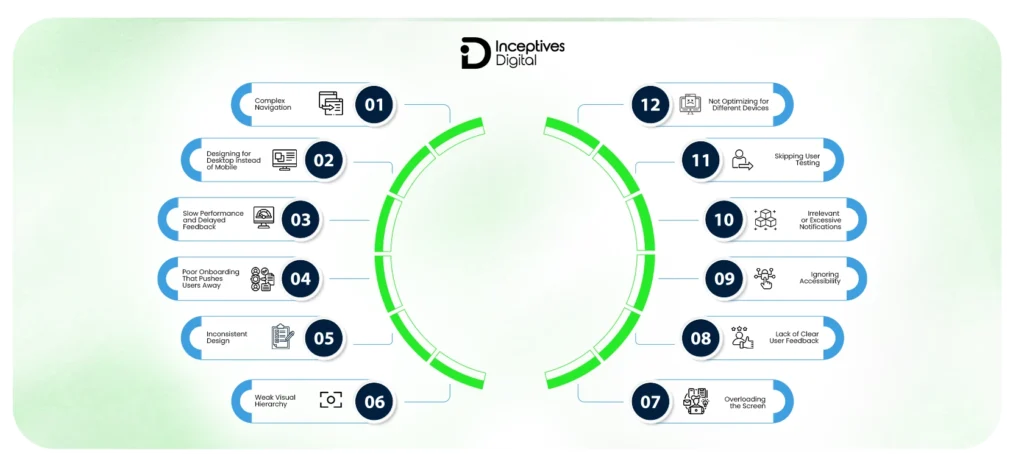
Mobile applications experience UI and UX mistakes because multiple factors contribute to these problems. These problems emerge from causes that include misaligned design decisions, a lack of user research, and noncompliance with usability standards. Designing for either iOS or Android app development, these mistakes can dramatically influence user retention, engagement, and overall product success.
Here are the most common UI/UX mistakes in mobile app development that you should avoid:
1. Complex Navigation That Breaks User Flow
Navigation allows users to move around freely inside your application. Too complex or unclear navigation can disturb the user’s direction, which could lead to abandoning the app. A common mobile app development mistake is that teams add too many unstructured features to the app without keeping the user behaviour in mind, which leads to issues like that.
What goes wrong:
- Deep navigation layers that require multiple taps
- Hidden menus that reduce discoverability
- Too many choices create decision fatigue
How to fix it:
- Keep navigation shallow and intuitive
- Make primary actions visible at all times
- Use familiar patterns like tab bars or bottom navigation
2. Designing for Desktop Instead of Mobile
Compared to a desktop environment, the mobile interface requires a completely different approach. Ignoring the touch functionality, screen size optimization, and limitations creates poor usability that leads to user frustration.
Common issues:
- Buttons placed outside natural thumb reach
- Overcrowded layouts, trying to fit too much content
- Small touch targets that reduce usability
How to fix it:
- Design for one-handed use and thumb zones
- Prioritize essential features only
- Follow mobile usability principles from Nielsen Norman Group
3. Slow Performance and Delayed Feedback
It is very frustrating when the app takes longer than usual or lags during operations. Users expect a quick response and an easy-to-use interface. Apps having performance issues or minor issues always struggle to gain user trust and engagement.
Common causes:
- Heavy images, animations, or UI assets
- Inefficient API calls and backend delays
- Lack of feedback during loading states
How to fix it:
- Optimize assets and reduce unnecessary animations
- Improve backend performance and API efficiency
- Use feedback elements like skeleton screens and loaders
4. Poor Onboarding That Pushes Users Away
The reason a user downloads an application is out of curiosity or a particular use case, and they expect to quickly move towards the actual value. Avoid overwhelming them with long tutorials when onboarding; instead, just guide them. It is most likely that a user will drop off if forced to go through lengthy tutorials at the time of onboarding.
Common mistakes:
- Lengthy onboarding flows
- Forced registration at the start
- Information overload
How to fix it:
- Let users explore before committing
- Keep onboarding short and optional
- Use contextual guidance instead of full tutorials
5. Inconsistent Design Across the App
Design consistency is a major factor in building user trust. If the design elements are different across the screens, it makes it difficult for the users to predict what is coming up next. This creates a gut feeling about the app being unreliable.
Impact:
- Confusion in interactions
- Reduced trust in the interface
- Unprofessional appearance
How to fix it:
- Implement a design system
- Standardize colors, typography, and components
- Use tools like Figma or Adobe XD for consistency
6. Weak Visual Hierarchy
Visual hierarchy helps users understand which parts of the content they should pay attention to. Without a visual hierarchy, screens are hard to read, which creates confusion about which actions users should take.
What happens:
- Important actions are not noticeable
- Users hesitate or make wrong decisions
How to fix it:
- Use contrast, size, and spacing effectively
- Highlight primary actions clearly
- Reduce visual noise around key elements
7. Overloading the Screen with Elements
People find it harder to use apps that have cluttered interfaces because they bring additional mental demands. Displaying excessive information creates confusion among users in processing all the content simultaneously.
What goes wrong:
- Too many elements competing for attention
- Lack of focus on a single user goal
How to fix it:
- Design each screen around one primary action
- Remove unnecessary elements
- Use whitespace to improve readability
8. Lack of Clear User Feedback
Feedback is a factor that determines the effectiveness of the user’s actions. An experience without feedback feels like a totally failed or dead experience.
Common issues:
- No response after tapping a button
- Missing progress indicators
How to fix it:
Add microinteractions such as:
- Button state changes
- Loading indicators
- Success and error messages
9. Ignoring Accessibility
Accessibility guarantees that your application can be used by more users. Ignoring it not only restricts user access but also diminishes overall user experience.
Common issues:
- Low contrast between text and background
- Small or unreadable fonts
- Lack of support for assistive technologies
How to fix it:
- Follow standards like Web Content Accessibility Guidelines
- Use readable font sizes and proper contrast
- Support accessibility features like screen readers
10. Irrelevant or Excessive Notifications
Notifications were meant to be facilitated, not to be imposing. Bad notifications are often a major source of customer dissatisfaction.
What goes wrong:
- Sending too many alerts
- Irrelevant or generic messages
How to fix it:
- Personalize notifications based on user behavior
- Send only high-value updates
- Allow users to control notification preferences
11. Skipping User Testing
User testing serves as the essential foundation for design work because designers need input from users to make informed decisions. This situation results in usability problems that become visible only after the product has been released.
What happens:
- Critical friction points remain hidden
- Features don’t align with user expectations
How to fix it:
- Conduct usability testing regularly
- Gather feedback from real users
- Use analytics to validate design decisions
12. Not Optimizing for Different Devices
Mobile applications run on various devices, which have different screen dimensions and processing power. The user experience becomes unstable when developers disregard the variety of devices.
Common issues:
- Layout breaks on certain screen sizes
- Performance issues on lower-end devices
How to fix it:
- Test across multiple devices and resolutions
- Use responsive and adaptive design techniques
- Optimize performance for different hardware, especially within the Android ecosystem
Patterns Behind These Mistakes (Why Teams Keep Repeating Them)
There is always a predictable pattern behind every UI/UX mobile app mistake. By understanding those patterns and with proper planning, you can definitely improve your mobile app’s UI/UX design.
Why Teams Keep Repeating the Same Mistakes
The reason is not always that your developers lack the required expertise. Mostly, it is because of unclear priorities during the development phase. Here are the common patterns behind these UI/UX design mistakes in mobile apps.
1. Feature-First Thinking Instead of User-First
One of the most frequent problems occurs when teams give higher importance to app features than to the app’s user experience. Teams show more dedication to building new features instead of developing better ways for users to interact with their products.
2. Lack of UX Research
People make decisions based on their assumptions because they lack sufficient research evidence. The internal design processes create logical performance flows that do not work when tested by real users.
3. Tight Deadlines and Rushed Design
When organizations focus on faster delivery, they decrease their efforts to validate user experience. Omitting usability testing, iteration, and refinement creates experiences that users find to be incomplete and inconsistent.
4. No Design System in Place
Without an organized design system, there will definitely be discrepancies between various screens. The app appears fragmented with no consistency towards standardized elements or patterns, hence increasing its complexity.
How to Identify UI/UX Issues in Your App (Practical Audit Framework)
After you learn about the reasons for these UI/UX mistakes that occur, you will need to start locating the mistakes through systematic procedures. The structured audit process helps remove hidden friction points that developers typically miss during development.
Step-by-Step UI/UX Audit Framework
1. Map the User Journey
Users who interact with your application should follow a specific path to finish their essential tasks. This way, organizations can comprehend user interactions while discovering parts of their system that need improvement.
2. Identify Friction Points
Find friction points where users struggle, hesitate, or abandon tasks. These points typically exemplify usability issues.
3. Analyze User Behavior
Use analytics to track:
- Drop-off rates
- Session duration
- Exit points
This data reveals where users are losing interest or facing challenges.
4. Test with Real Users
Observe and note how real users interact with your app. During real user condition tests, so many issues unimaginable by internal teams come to light.
5. Prioritize High-Impact Fixes
Direct your efforts toward changes that provide the greatest benefits. You will achieve better results by tackling essential usability problems before they start working on other tasks.
UI/UX Best Practices to Avoid These Mistakes From Day One
To avoid these UI/UX mistakes, you have to set the tone from the very start of the app development process, instead of thinking about fixing them in later stages. Your app’s design and development should be in accordance with user behaviour to ensure maximum retention, reduce friction, and develop a scalable mobile application. Here are the proven UI/UX best practices that you should follow:
Core UI/UX Best Practices Checklist
1. Keep Navigation Simple and Predictable
Users should experience navigation as a simple process. The app must provide clear directions to users for the next steps and current task completion needs. The app achieves effective user navigation through design, which uses shallow and simple paths that follow common user patterns.
2. Design Mobile-First, Not Desktop-Adapted
Mobile interfaces require a unique design approach because the development process needs special treatment. Designers who use mobile-first design create layouts that users will find most effective on small screens, which support gestures and one-handed usage.
3. Maintain Consistency Across the Entire App
A consistent design creates trust among users and makes the app familiar. An application with consistent design components, like colors, typography, and interaction patterns, allows the user to get used to the interface and navigate through it with confidence.
4. Optimize Performance at Every Level
Performance optimization is an essential part of a well-considered user experience. Mostly, users get frustrated when the app takes more time to load and respond, creating a sense of unreliability in their minds. To avoid performance issues, optimize assets, reduce unimportant operations, and ensure efficient data handling from the very start of the project.
5. Focus on Usability Over Visual Complexity
An attractive interface needs to be developed, but its primary focus should be on providing users with efficient ways to navigate. The combination of clean layouts, clear actions, and logical flows provides better results than design elements that create excessive visual ornamentation, which diverts users from their tasks.
6. Test Continuously and Iterate Based on Data
UI/UX design work never reaches a point of complete finalization. The combination of usability testing and user feedback collection, together with behavioral analytics, enables businesses to discover problems early in development and use them to drive ongoing system enhancements. The application development process uses actual user data to create new features according to the changing requirements of its users.
Following these best practices early in the development process not only prevents common UI/UX mistakes but also creates a strong foundation for long-term user engagement and product growth.
Tools That Help Improve UI/UX in Mobile App Development
Below are the key categories of tools and mobile app tech stack that play a critical role in improving mobile app user experience.
Design Tools
Design tools enable designers to build the visual interface of the application by creating page layouts, components, and design systems. The tools enable designers to work together with developers while maintaining visual design standards throughout their projects.
Popular options include:
- Figma for collaborative interface design and design systems
- Adobe XD for wireframing and interactive design
- Sketch for vector-based UI design
Prototyping Tools
Prototyping tools show how users will use your app before development work starts. It is a critical task in the mobile app development process because it enables testing of user flows and discovery of usability problems at an initial stage.
Commonly used tools:
- InVision for interactive prototypes and collaboration
- Axure RP for complex interaction design and advanced prototypes
Prototype testing enables teams to fine-tune navigation, interactions, and flows prior to development, avoiding the cost of rework.
Analytics Tools
Analytics tools provide actual user interaction data, which shows how users engage with your application. These tools detect friction points through actual user behavior analysis instead of using guesses to determine user experience issues.
Widely used platforms:
- Google Analytics for tracking user behavior and engagement
- Firebase Analytics for app-specific insights and performance tracking
- Mixpanel for event tracking and user journey analysis
What these tools can show you is where your users are dropping out, what features are heavily used, and where to make improvements.
What to Track for Better UI/UX Decisions
Using tools requires people to choose helpful measurement methods to achieve successful results. Tracking important data enables you to make decisions while you work on improving user experiences.
Key Metrics to Monitor
- Retention Rate
- Session Duration
Conversion Rate
You can achieve data-driven decision-making through the correct combination of design tools, prototyping tools, and analytics tools. Your app development process benefits from this method because it uses actual user interactions to determine which features should be developed instead of relying on assumptions about user behavior.
Emerging UI/UX Trends in Mobile Apps
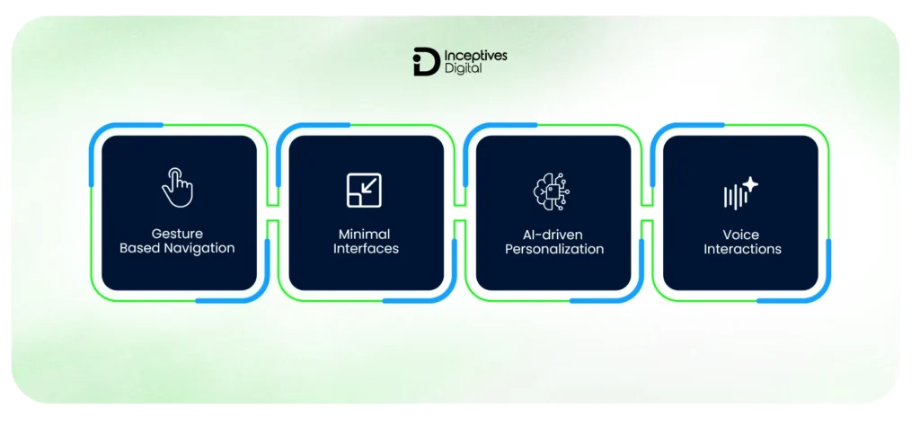
Mobile UI/UX is evolving quickly as user expectations and technologies change. Staying updated with current trends helps create faster, more intuitive, and engaging app experiences.
1. Gesture-Based Navigation
Apps now use gestures like swipes and taps instead of buttons to create better user experiences while saving space on their displays. This approach is widely used in iOS and Android.
The key is to find the right balance between simple and clear design to allow users to understand all available options.
2. Minimal Interfaces
Currently, mobile applications prefer simple designs due to the user behaviour changes. The advantage of a minimal design is that it keeps the focus on the important aspects, improves usability, and ensures as few distractions as possible.
Instead of presenting multiple options, the minimalist design approach provides:
- Clean layouts
- Generous whitespace
- Clear visual hierarchy
It will not only enhance readability but also speed up decision-making, making the whole procedure more efficient and user-friendly in the long run.
3. AI-Driven Personalization
Personalization has developed into an essential element of user experience design. Implementing artificial intelligence enables applications to change their content, recommendations, and user interactions according to actual user behavior.
For example, platforms such as Netflix and Spotify use AI to deliver customized content, leading to increased usage and customer retention.
In mobile apps, AI-driven UX can be applied to:
- Personalized content feeds
- Smart recommendations
- Predictive user flows
4. Voice Interactions
Voice-based interactions have become more popular because users want to access applications through faster and more convenient methods. Voice integration enables users to execute tasks through voice commands without needing to go through multiple interface screens.
Thanks to Google Assistant and Apple Siri, it is justified to say that voice interfaces have proven themselves to become something that is widely used in the arena of mobile phones.
Voice UX is particularly useful for:
- Search and commands
- Accessibility improvements
- Hands-free interactions
Conclusion: Small UI/UX Fixes Can Lead to Big Growth
UI/UX mistakes in mobile app development are rarely obvious at first, but their impact shows up quickly in user behavior. From confusing navigation to poor performance and lack of feedback, even small issues can lead to frustration, drop-offs, and lost opportunities. A good option is to hire the right mobile app development company that approaches design with a user-first mindset, focuses on clarity over complexity, and continuously tests and refines the experience. When done right, good UI/UX doesn’t just improve usability, it directly contributes to retention, engagement, and overall product success.
If you’re planning to build or improve an app, taking the time to evaluate these aspects early can save significant effort later. Whether you’re refining an existing product or starting from scratch, investing in thoughtful UI/UX and reliable mobile app development services in USA can help you create an experience that users actually enjoy and return to.
CTA SECTION START
cta title: Create an App Experience That Keeps Users Coming Back
cta des: Turn drop-offs into engagement with expert mobile app development services focused on performance, usability, and real user behavior.
cta button: Start Improving Your App UX
CTA SECTION END
Frequently Asked Questions About UI/UX Mistakes in Mobile App Development
The most common UI/UX mistakes include complex navigation, slow performance, poor onboarding, inconsistent design, lack of user feedback, and ignoring accessibility. These issues create friction and make it harder for users to interact with the app effectively.
Poor UI/UX leads to higher uninstall rates, lower user retention, and reduced conversions. When users find an app confusing or slow, they are more likely to abandon it and switch to alternatives.
UI (User Interface) focuses on the visual elements like buttons, colors, and layout, while UX (User Experience) focuses on how users interact with the app, including usability, flow, and overall satisfaction.
Improving UX involves simplifying navigation, optimizing performance, maintaining design consistency, conducting user testing, and using analytics to understand user behavior and fix friction points.
Users uninstall apps due to poor performance, confusing interfaces, excessive ads or notifications, and a lack of value. A frustrating or slow experience often leads users to abandon the app within a short time.
SIDEBAR LIST START
- Common UI/UX Mistakes in Mobile App Development
- Why UI/UX Mistakes Are the Silent Reason Apps Fail
- UI vs UX in Mobile Apps (Quick Context That Actually Matters)
- The Business Impact of Poor UI/UX (What It Actually Costs You)
- Most Common UI/UX Mistakes in Mobile App Development
- Patterns Behind These Mistakes (Why Teams Keep Repeating Them)
- UI/UX Best Practices to Avoid These Mistakes From Day One
- Tools That Help Improve UI/UX in Mobile App Development
- Emerging UI/UX Trends in Mobile Apps
- Conclusion: Small UI/UX Fixes Can Lead to Big Growth
- Frequently Asked Questions About UI/UX Mistakes in Mobile App Development
SIDEBAR LIST END